代码拉取完成,页面将自动刷新
VisualDL is a visualization tool designed for Deep Learning. VisualDL provides a variety of charts to show the trends of parameters. It enables users to understand the training process and model structures of Deep Learning models more clearly and intuitively so as to optimize models efficiently.
Currently, VisualDL provides Fifteen Components: scalar, image, audio, text, graph(dynamic, static), histogram, pr curve, ROC curve, high dimensional and hyperparameters, profiler, x2paddle, fastdeployserver, fastdeployclient. VisualDL iterates rapidly and new functions will be continuously added.
| Component Name | Display Chart | Function |
|---|---|---|
| Scalar | Line Chart | Display scalar data such as loss and accuracy dynamically. |
| Image | Image Visualization | Display images, visualizing the input and the output and making it easy to view the changes in the intermediate process. |
| Audio | Audio Play | Play the audio during the training process, making it easy to monitor the process of speech recognition and text-to-speech. |
| Text | Text Visualization | Visualize the text output of NLP models within any stage, aiding developers to compare the changes of outputs so as to deeply understand the training process and simply evaluate the performance of the model. |
| Graph | Network Structure | Visualize network structures, node attributes and data flow, assisting developers to learn and to optimize network structures. |
| Histogram | Distribution of Tensors | Present the changes of distributions of tensors, such as weights/gradients/bias, during the training process. |
| PR Curve | Precision & Recall Curve | Display precision-recall curves across training steps, clarifying the tradeoff between precision and recall when comparing models. |
| ROC Curve | Receiver Operating Characteristic curve | Show the performance of a classification model at all classification thresholds. |
| High Dimensional | Data Dimensionality Reduction | Project high-dimensional data into 2D/3D space for embedding visualization, making it convenient to observe the correlation between data. |
| Hyper Parameters | HyperParameter Visualization | Visualize the relationship between hyperparameters and model metrics (such as accuracy and loss) in a rich view, helping you identify the best hyperparameters in an efficient way. |
| Profiler | Profiling data visualization | Analyse profiling data exported by paddle, helping users identify program bottlenecks and optimize performance |
| X2Paddle | Model conversion | Convert onnx model to paddle format |
| FastDeployServer | fastdeploy serving deployment visualization | Provide the functions of loading and editing the model repository, fastdeployserver service management and monitoring |
| FastDeployClient | fastdeploy client for request visualization | Access the fastdeployserver service, helping users visualize prediction requests and results |
At the same time, VisualDL provides VDL.service , which allows developers to easily save, track and share visualization results of experiments with anyone for free.
The data type of the input is scalar values. Scalar is used to present the training parameters in the form of a line chart. By using Scalar to record loss and accuracy, developers are able to track the trend of changes easily through line charts.
The interface of the Scalar is shown as follows:
add_scalar(tag, value, step, walltime=None)
The interface parameters are described as follows:
| parameter | format | meaning |
|---|---|---|
| tag | string | Record the name of the scalar data,e.g.train/loss. Notice that the name cannot contain %
|
| value | float | Record the data, can't be None
|
| step | int | Record the training steps. The data will be sampled, meaning that only part of data will be displayed. (the sampling algorithm is reservoir sampling, details can be refered to VisualDL sampling algorithm) |
| walltime | int | Record the time-stamp of the data, the default is the current time-stamp |
*Note that the rules of specifying tags (e.g.train/acc) are:
/ is the parent tag and serves as the tag of the same raw/ is a child tag, the charts with child tag will be displayed under the parent tag. The data of the same parent tag but different child tags will be displayed in the same column, but not in the same picture./, but the tag of a raw is the parent tag--the tag before the first /
Here are three examples:
train/acc、 train/loss,the tag of a raw is 'train' , which includes two sub charts--'acc' and 'loss':

train/test/acc、 train/test/loss, the tag of a raw is 'train', which includes two sub charts--'test/acc' and 'test/loss':

acc、 loss, two rows of charts are named as 'acc' and 'loss' respectively.

The following shows an example of using Scalar to record data, and the script can be found in Scalar Demo
from visualdl import LogWriter

if __name__ == '__main__':
    value = [i/1000.0 for i in range(1000)]
    # initialize a recorder
    with LogWriter(logdir="./log/scalar_test/train") as writer:
        for step in range(1000):
            # add accuracy with tag of 'acc' to the recorder
            writer.add_scalar(tag="acc", step=step, value=value[step])
            # add loss with tag of 'loss' to the recorder
            writer.add_scalar(tag="loss", step=step, value=1/(value[step] + 1))
After running the above program, developers can launch the panel by:
visualdl --logdir ./log --port 8080
Then, open the browser and enter the address: http://127.0.0.1:8080to view line charts:

The following shows the comparison of multiple sets of experiments using Scalar.
There are two steps to achieve this function:
from visualdl import LogWriter

if __name__ == '__main__':
    value = [i/1000.0 for i in range(1000)]
    # Step 1: Create a parent folder: log and a child folder: scalar_test
    with LogWriter(logdir="./log/scalar_test") as writer:
        for step in range(1000):
            # Step 2: Add data with tag train/acc to the recorder
            writer.add_scalar(tag="train/acc", step=step, value=value[step])
            # Step 2: Add data with tag train/loss to the recorder
            writer.add_scalar(tag="train/loss", step=step, value=1/(value[step] + 1))
    # Step 1: Create a second child folder: scalar_test2
    value = [i/500.0 for i in range(1000)]
    with LogWriter(logdir="./log/scalar_test2") as writer:
        for step in range(1000):
            # Step 2: Add the accuracy data of scalar_test2 under the same name `train/acc`
            writer.add_scalar(tag="train/acc", step=step, value=value[step])
            # Step 2: Add the loss data of scalar_test2 under the same name as `train/loss`
            writer.add_scalar(tag="train/loss", step=step, value=1/(value[step] + 1))
After running the above program, developers can launch the panel by:
visualdl --logdir ./log --port 8080
Then, open the browser and enter the address: http://127.0.0.1:8080 to view line charts:

![]()


The Image is used to present the change of image data during training. Developers can view images in different training stages by adding few lines of codes to record images in a log file.
The interface of the Image is shown as follows:
add_image(tag, img, step, walltime=None, dataformats="HWC")
The interface parameters are described as follows:
| parameter | format | meaning |
|---|---|---|
| tag | string | Record the name of the image data,e.g.train/loss. Notice that the name cannot contain %
|
| img | numpy.ndarray | Images in ndarray format. The default HWC format dimension is [h, w, c], h and w are the height and width of the images, and c is the number of channels, which can be 1, 3, 4. Floating point data will be clipped to the range[0, 1), and note that the image data cannot be None. |
| step | int | Record the training steps |
| walltime | int | Record the time-stamp of the data, the default is the current time-stamp |
| dataformats | string | Format of image,include NCHW、NHWC、HWC、CHW、HW,default is HWC. It will be converted to HWC format when stored. |
The following shows an example of using Image to record data, and the script can be found in Image Demo.
import numpy as np
from PIL import Image
from visualdl import LogWriter


def random_crop(img):
    """get random 100x100 slices of image
    """
    img = Image.open(img)
    w, h = img.size
    random_w = np.random.randint(0, w - 100)
    random_h = np.random.randint(0, h - 100)
    r = img.crop((random_w, random_h, random_w + 100, random_h + 100))
    return np.asarray(r)


if __name__ == '__main__':
    # initialize a recorder
    with LogWriter(logdir="./log/image_test/train") as writer:
        for step in range(6):
            # add image data
            writer.add_image(tag="eye",
                             img=random_crop("../../docs/images/eye.jpg"),
                             step=step)
After running the above program, developers can launch the panel by:
visualdl --logdir ./log --port 8080
Then, open the browser and enter the address: http://127.0.0.1:8080to view:


Audio aims to allow developers to listen to the audio in real-time during the training process, helping developers to monitor the process of speech recognition and text-to-speech.
The interface of the Image is shown as follows:
add_audio(tag, audio_array, step, sample_rate)
The interface parameters are described as follows:
| parameter | format | meaning |
|---|---|---|
| tag | string | Record the name of the audio,e.g.audoi/sample. Notice that the name cannot contain %
|
| audio_arry | numpy.ndarray | Audio in ndarray format, whose elements are float values, and the range should be normalized in [-1, 1] |
| step | int | Record the training steps |
| sample_rate | int | Sample rate,the default sampling rate is 8000. Please note that the rate should be the rate of the original audio |
The following shows an example of using Audio to record data, and the script can be found in Audio Demo.
from visualdl import LogWriter
from scipy.io import wavfile


if __name__ == '__main__':
    with LogWriter(logdir="./log/audio_test/train") as writer:
        sample_rate, audio_data = wavfile.read('./test.wav')
        writer.add_audio(tag="audio_tag",
                         audio_array=audio_data,
                         step=0,
                         sample_rate=sample_rate)
After running the above program, developers can launch the panel by:
visualdl --logdir ./log --port 8080
Then, open the browser and enter the address: http://127.0.0.1:8080to view:


visualizes the text output of NLP models within any stage, aiding developers to compare the changes of outputs so as to deeply understand the training process and simply evaluate the performance of the model.
The interface of the Text is shown as follows:
add_text(tag, text_string, step=None, walltime=None)
The interface parameters are described as follows:
| parameter | format | meaning |
|---|---|---|
| tag | string | Record the name of the text data,e.g.train/loss. Notice that the name cannot contain %
|
| text_string | string | Value of text |
| step | int | Record the training steps |
| walltime | int | Record the time-stamp of the data, and the default is the current time-stamp |
The following shows an example of how to use Text component, and script can be found in Text Demo
from visualdl import LogWriter
if __name__ == '__main__':
    texts = [
        '上联: 众 佛 群 灵 光 圣 地	下联: 众 生 一 念 证 菩 提',
        '上联: 乡 愁 何 处 解	下联: 故 事 几 时 休',
        '上联: 清 池 荷 试 墨	下联: 碧 水 柳 含 情',
        '上联: 既 近 浅 流 安 笔 砚	下联: 欲 将 直 气 定 乾 坤',
        '上联: 日 丽 萱 闱 祝 无 量 寿	下联: 月 明 桂 殿 祝 有 余 龄',
        '上联: 一 地 残 红 风 拾 起	下联: 半 窗 疏 影 月 窥 来'
    ]
    with LogWriter(logdir="./log/text_test/train") as writer:
        for step in range(len(texts)):
            writer.add_text(tag="output", step=step, text_string=texts[step])
After running the above program, developers can launch the panel by:
visualdl --logdir ./log --port 8080
Then, open the browser and enter the addresshttp://127.0.0.1:8080 to view:

Developers can find the target text by searching corresponded tags.

Developers can find the target runs by searching corresponded tags.

Developers can fold the tab of text.

Graph can visualize the network structure of the model by one click. It enables developers to view the model attributes, node information, searching node and so on. These functions help developers analyze model structures and understand the directions of data flow quickly.
The interface of the Graph is shown as follows:
add_graph(model, input_spec, verbose=False):
The interface parameters are described as follows:
| parameter | format | meaning |
|---|---|---|
| model | paddle.nn.Layer | Dynamic model of paddle |
| input_spec | list[paddle.static.InputSpec|Tensor] | Describes the input of the saved model's forward arguments |
| verbose | bool | Whether to print graph statistic information in console. |
Note
If you want to use add_graph interface, paddle package is required. Please refer to website of PaddlePaddle。
The following shows an example of how to use Graph component, and script can be found in Graph Demo There are two methods to launch this component:
import paddle
import paddle.nn as nn
import paddle.nn.functional as F

from visualdl import LogWriter


class MyNet(nn.Layer):
    def __init__(self):
        super(MyNet, self).__init__()
        self.conv1 = nn.Conv2D(
            in_channels=1, out_channels=20, kernel_size=5, stride=1, padding=2)
        self.max_pool1 = nn.MaxPool2D(kernel_size=2, stride=2)
        self.conv2 = nn.Conv2D(
            in_channels=20,
            out_channels=20,
            kernel_size=5,
            stride=1,
            padding=2)
        self.max_pool2 = nn.MaxPool2D(kernel_size=2, stride=2)
        self.fc = nn.Linear(in_features=980, out_features=10)

    def forward(self, inputs):
        x = self.conv1(inputs)
        x = F.relu(x)
        x = self.max_pool1(x)
        x = self.conv2(x)
        x = F.relu(x)
        x = self.max_pool2(x)
        x = paddle.reshape(x, [x.shape[0], -1])
        x = self.fc(x)
        return x


net = MyNet()
with LogWriter(logdir="./log/graph_test/") as writer:
    writer.add_graph(
        model=net,
        input_spec=[paddle.static.InputSpec([-1, 1, 28, 28], 'float32')],
        verbose=True)
After running the above program, developers can launch the panel by:
visualdl --logdir ./log/graph_test/ --port 8080
Then, open the browser and enter the addresshttp://127.0.0.1:8080 to view:

Note
We provide option --model to specify model structure file in previous versions, and this option is still supported now. You can specify model exported by add_graph interface ("vdlgraph" contained in filename), which will be shown in dynamic graph page, and we use string "manual_input_model" in the page to denote the model you specify by this option. Other supported file formats are presented in static graph page.
For example
visualdl --model ./log/model.pdmodel --port 8080
which will be shown in static graph page. And
visualdl --model ./log/vdlgraph.1655783158.log --port 8080
shown in dynamic graph page.
Graph page is divided into dynamic and static version currently. Dynamic version is used to visualize dynamic model of paddle, which is exported by add_graph interface. The other is used to visualize static model of paddle, which is exported by paddle.jit.save interface and other supported formats.

Common functions


Specific feature in dynamic version


Link api specification of paddle
If you use paddle.nn components to construct your network model, you can use alt+click mouse to direct to corresponding api specification.


Specific feature in static version

Histogram displays how the trend of tensors (weight, bias, gradient, etc.) changes during the training process in the form of histogram. Developers can adjust the model structures accurately by having an in-depth understanding of the effect of each layer.
The interface of the Histogram is shown as follows:
add_histogram(tag, values, step, walltime=None, buckets=10)
The interface parameters are described as follows:
| parameter | format | meaning |
|---|---|---|
| tag | string | Record the name of the image data,e.g.train/loss. Notice that the name cannot contain %
|
| values | numpy.ndarray or list | Data is in ndarray or list format, which shape is (N, ) |
| step | int | Record the training steps |
| walltime | int | Record the time-stamp of the data, and the default is the current time-stamp |
| buckets | int | The number of segments to generate the histogram and the default value is 10 |
The following shows an example of using Histogram to record data, and the script can be found in Histogram Demo
from visualdl import LogWriter
import numpy as np


if __name__ == '__main__':
    values = np.arange(0, 1000)
    with LogWriter(logdir="./log/histogram_test/train") as writer:
        for index in range(1, 101):
            interval_start = 1 + 2 * index / 100.0
            interval_end = 6 - 2 * index / 100.0
            data = np.random.uniform(interval_start, interval_end, size=(10000))
            writer.add_histogram(tag='default tag',
                                 values=data,
                                 step=index,
                                 buckets=10)
After running the above program, developers can launch the panel by:
visualdl --logdir ./log --port 8080
Then, open the browser and enter the address: http://127.0.0.1:8080to view the histogram.
Developers are allowed to zoom in and download the histogram.
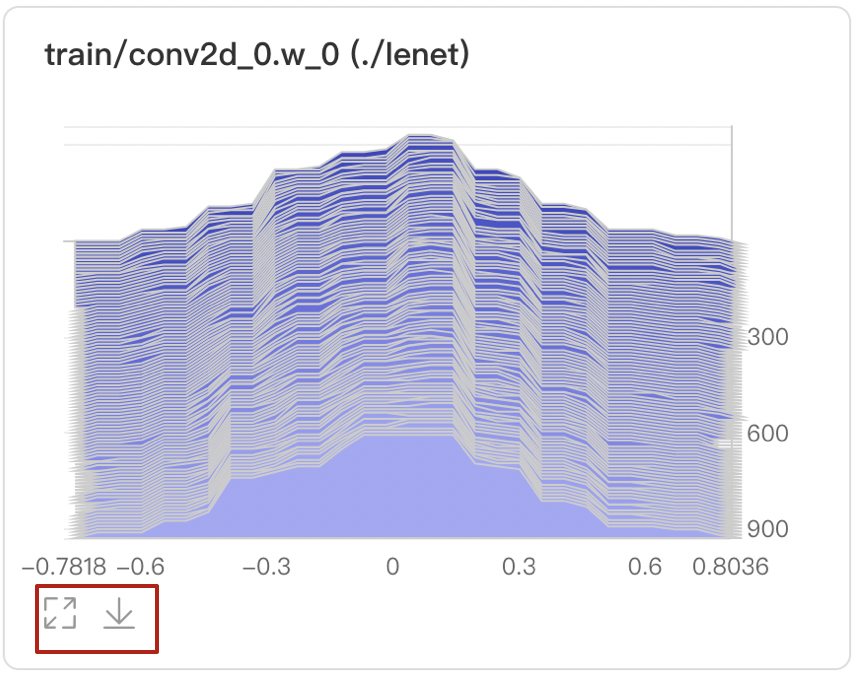
Provide two modes: Offset and Overlay.

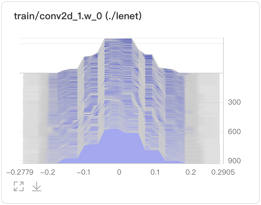
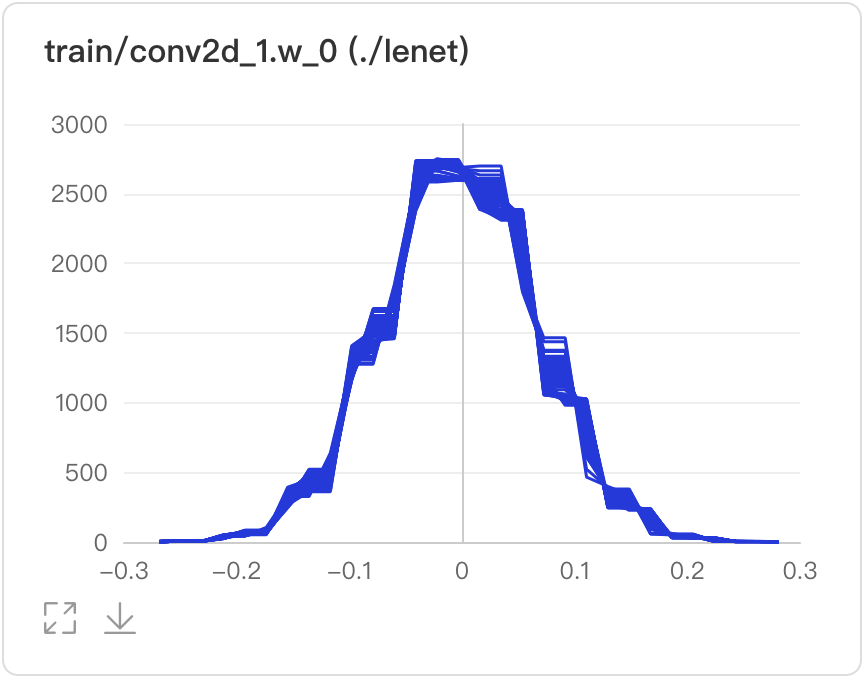
Display the parameters、training steps and frequency by hovering on specific data points.
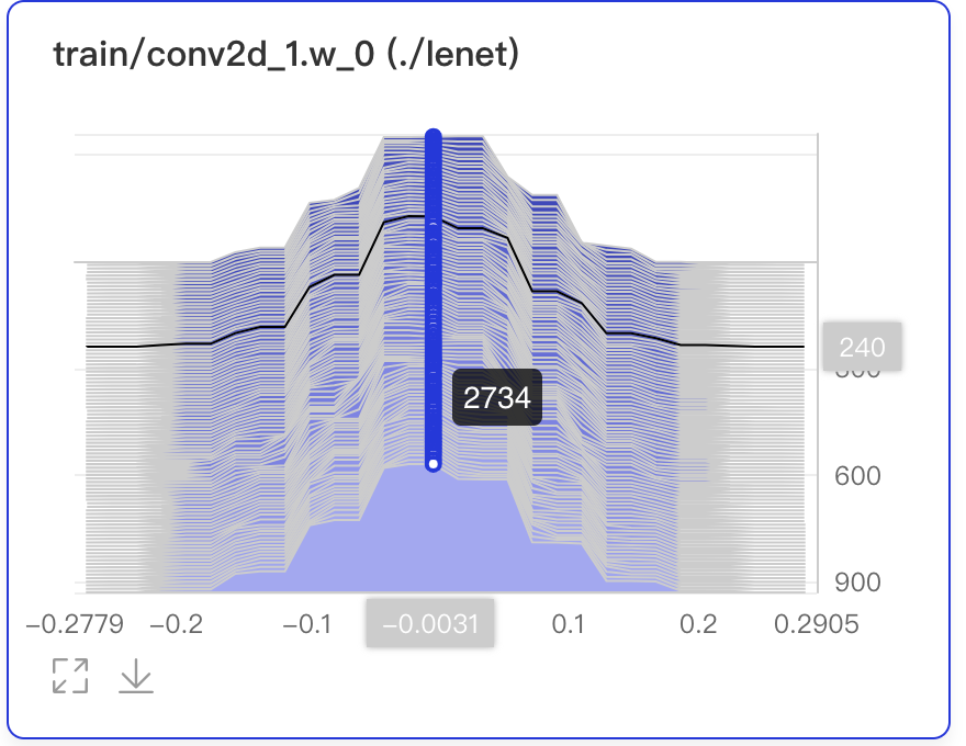
Developers can find target histogram by searching corresponded tags.

Search tags to show the histograms generated by corresponded experiments.

PR Curve presents precision-recall curves in line charts, describing the tradeoff relationship between precision and recall in order to choose a best threshold.
The interface of the PR Curve is shown as follows:
add_pr_curve(tag, labels, predictions, step=None, num_thresholds=10)
The interface parameters are described as follows:
| parameter | format | meaning |
|---|---|---|
| tag | string | Record the name of the image data,e.g.train/loss. Notice that the name cannot contain %
|
| labels | numpy.ndarray or list | Data is in ndarray or list format, which shape should be (N, ) and value should be 0 or 1 |
| predictions | numpy.ndarray or list | Prediction data is in ndarray or list format, which shape should be (N, ) and value should in [0, 1] |
| step | int | Record the training steps |
| num_thresholds | int | Set the number of thresholds, default as 10, maximum as 127 |
| weights | float | Set the weights of TN/FN/TP/FP to calculate precision and recall |
| walltime | int | Record the time-stamp of the data, and the default is the current time-stamp |
The following shows an example of how to use PR Curve component, and script can be found in PR Curve Demo
from visualdl import LogWriter
import numpy as np

with LogWriter("./log/pr_curve_test/train") as writer:
    for step in range(3):
        labels = np.random.randint(2, size=100)
        predictions = np.random.rand(100)
        writer.add_pr_curve(tag='pr_curve',
                            labels=labels,
                            predictions=predictions,
                            step=step,
                            num_thresholds=5)
After running the above program, developers can launch the panel by:
visualdl --logdir ./log --port 8080
Then, open the browser and enter the addresshttp://127.0.0.1:8080 to view:

Developers can zoom in, restore, and download PR Curves
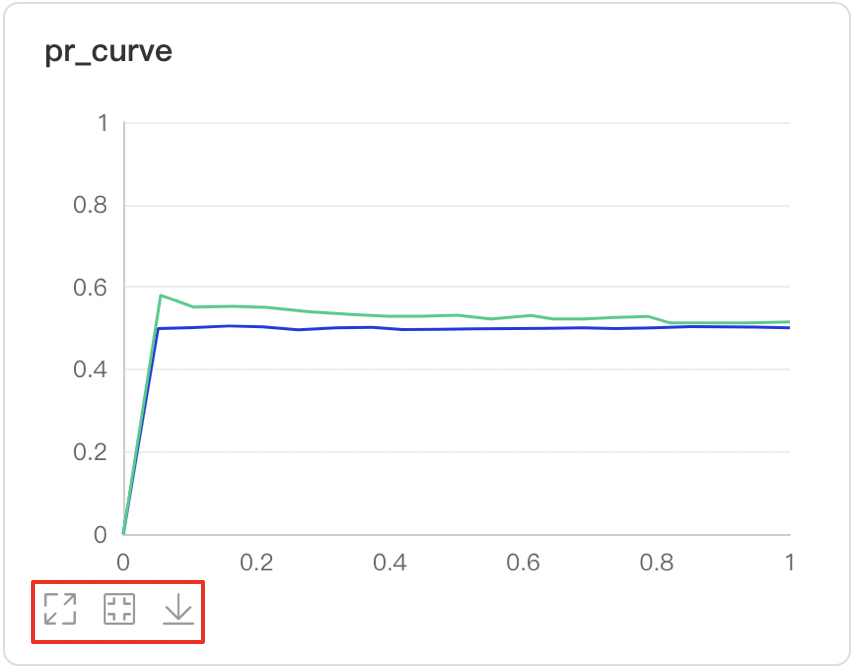
Developers hover on the specific data point to learn about the detailed information: TP, TN, FP, FN and the corresponded thresholds

The targeted PR Curves can be displayed by searching tags

Developers can find specific labels by searching tags or view the all labels

Developers is able to observe the changes of PR Curves across training steps

There are three measurement scales of X axis

ROC Curve shows the performance of a classification model at all classification thresholds; the larger the area under the curve, the better the model performs, aiding developers to evaluate the model performance and choose an appropriate threshold.
The interface of the PR Curve is shown as follows:
add_roc_curve(tag, labels, predictions, step=None, num_thresholds=10)
The interface parameters are described as follows:
| parameter | format | meaning |
|---|---|---|
| tag | string | Record the name of the image data,e.g.train/loss. Notice that the name cannot contain %
|
| values | numpy.ndarray or list | Data is in ndarray or list format, which shape should be (N, ) and value should be 0 or 1 |
| predictions | numpy.ndarray or list | Prediction data is in ndarray or list format, which shape should be (N, ) and value should in [0, 1] |
| step | int | Record the training steps |
| num_thresholds | int | Set the number of thresholds, default as 10, maximum as 127 |
| weights | float | Set the weights of TN/FN/TP/FP to calculate precision and recall |
| walltime | int | Record the time-stamp of the data, and the default is the current time-stamp |
The following shows an example of how to use ROC curve component, and script can be found in ROC Curve Demo
from visualdl import LogWriter
import numpy as np

with LogWriter("./log/roc_curve_test/train") as writer:
    for step in range(3):
        labels = np.random.randint(2, size=100)
        predictions = np.random.rand(100)
        writer.add_roc_curve(tag='roc_curve',
                             labels=labels,
                             predictions=predictions,
                             step=step,
                             num_thresholds=5)
After running the above program, developers can launch the panel by:
visualdl --logdir ./log --port 8080
Then, open the browser and enter the addresshttp://127.0.0.1:8080 to view:
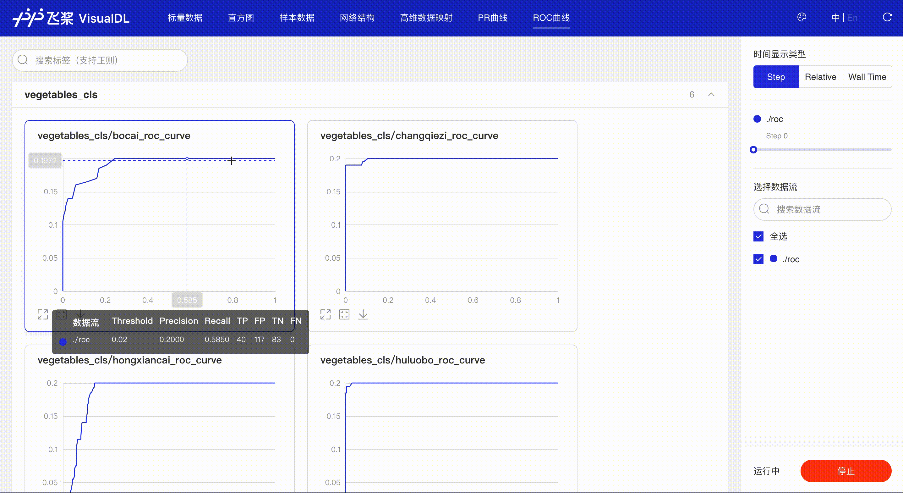
*Note: the use of ROC Curve in the frontend is the same as that of PR Curve, please refer to the instructions in PR Curve section if needed.
High Dimensional projects high-dimensional data into a low dimensional space, aiding users to have an in-depth analysis of the relationship between high-dimensional data. Three dimensionality reduction algorithms are supported:
The interface of the High Dimensional is shown as follows:
add_embeddings(tag, labels, hot_vectors, walltime=None)
The interface parameters are described as follows:
| parameter | format | meaning |
|---|---|---|
| tag | string | Record the name of the high dimensional data, e.g.default. Notice that the name cannot contain %
|
| labels | numpy.array or list | Represents the label of hot_vectors. The shape of labels should be (N, ) if only one dimension, and should be (M, N) if dimension of labels more than one, where each element is a one-dimensional label array. Each element is string type. |
| hot_vectors | numpy.array or list | Each element can be seen as a feature of the tag corresponding to the label. |
| labels_meta | numpy.array or list | The labels of parameter labels correspond to labels one-to-one. If not specified, the default value __metadata__ will be used. When parameter labels is a one-dimensional array, there is no need to specify this parameter |
| walltime | int | Record the time stamp of the data, the default is the current time stamp. |
The following shows an example of how to use High Dimensional component, and script can be found in High Dimensional Demo
from visualdl import LogWriter


if __name__ == '__main__':
    hot_vectors = [
        [1.3561076367500755, 1.3116267195134017, 1.6785401875616097],
        [1.1039614644440658, 1.8891609992484688, 1.32030488587171],
        [1.9924524852447711, 1.9358920727142739, 1.2124401279391606],
        [1.4129542689796446, 1.7372166387197474, 1.7317806077076527],
        [1.3913371800587777, 1.4684674577930312, 1.5214136352476377]]

    labels = ["label_1", "label_2", "label_3", "label_4", "label_5"]
    # initialize a recorder
    with LogWriter(logdir="./log/high_dimensional_test/train") as writer:
        # recorde a set of labels and corresponding hot_vectors to the recorder
        writer.add_embeddings(tag='default',
                              labels=labels,
                              hot_vectors=hot_vectors)
After running the above program, developers can launch the panel by:
visualdl --logdir ./log --port 8080
Then, open the browser and enter the addresshttp://127.0.0.1:8080 to view:
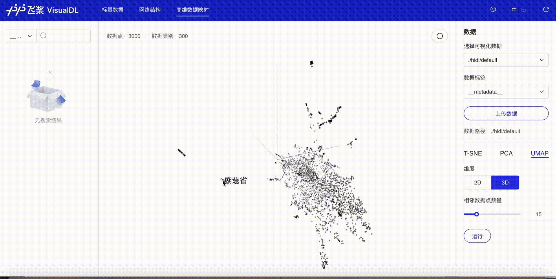
Developers are allowed to select specific runs of data or certain labels of data to display

TSNE

PCA

UMAP

HyperParameters visualize the relationship between hyperparameters and model metrics (such as accuracy and loss) in a rich view, helping you identify the best hyperparameters in an efficient way.
The interface of the HyperParameters is slightly different from other components'. Firstly, you need to use the add_hparams to record the hyperparameter data(hparams_dict) and specify the name of the metrics(metrics_list). Then, for the metrics you just added, you need to record those metrics values by using add_scalar. In this way you can get all data for HpyerParameters Visualization.
add_hparams(hparam_dict, metric_list, walltime=None):
The interface parameters are described as follows:
| parameter | format | meaning |
|---|---|---|
| hparam_dict | dict | name and data of hparams. |
| metric_list | list | The metrics name to be recorded later corresponds to the tag parameter in the add_scalar interface, and VisualDL corresponds to the indicator data through the tag. |
| walltime | int | Record the time stamp of the data, the default is the current time stamp. |
The following shows an example of how to use HyperParameters component, and script can be found in HyperParameters Demo
from visualdl import LogWriter
# This demo demonstrates the hyperparameter records of two experiments. Take the first
# experiment data as an example, First, record the data of the hyperparameter `hparams`
# in the `add_hparams` interface. Then specify the name of `metrics` to be recorded later.
# Finally, use `add_scalar` to specifically record the data of `metrics`. Note that the
# `metrics_list` parameter in the `add_hparams` interface needs to include the `tag`
# parameter of the `add_scalar` interface.
if __name__ == '__main__':
# Record the data of the first experiment
with LogWriter('./log/hparams_test/train/run1') as writer:
# Record the value of `hparams` and the name of `metrics`
writer.add_hparams(hparams_dict={'lr': 0.1, 'bsize': 1, 'opt': 'sgd'},
metrics_list=['hparam/accuracy', 'hparam/loss'])
# Record the metrics values of different steps in an experiment by matching
# the `tag` in the `add_scalar` interface with `metrics_list` in `add_hparams` interface.
for i in range(10):
writer.add_scalar(tag='hparam/accuracy', value=i, step=i)
writer.add_scalar(tag='hparam/loss', value=2*i, step=i)
# Record the data of the second experiment
with LogWriter('./log/hparams_test/train/run2') as writer:
# Record the value of `hparams` and the name of `metrics`
writer.add_hparams(hparams_dict={'lr': 0.2, 'bsize': 2, 'opt': 'relu'},
metrics_list=['hparam/accuracy', 'hparam/loss'])
# Record the metrics values of different steps in an experiment by matching
# the `tag` in the `add_scalar` interface with `metrics_list` in `add_hparams` interface.
for i in range(10):
writer.add_scalar(tag='hparam/accuracy', value=1.0/(i+1), step=i)
writer.add_scalar(tag='hparam/loss', value=5*i, step=i)
After running the above program, developers can launch the panel by:
visualdl --logdir ./log --port 8080
Then, open the browser and enter the addresshttp://127.0.0.1:8080 to view:

Table View

Parallel Coordinates View

Scatter Plot Matrix View

Scalar of Metrics
SCALARS board.

Hyperparameter/metric range selection

download data

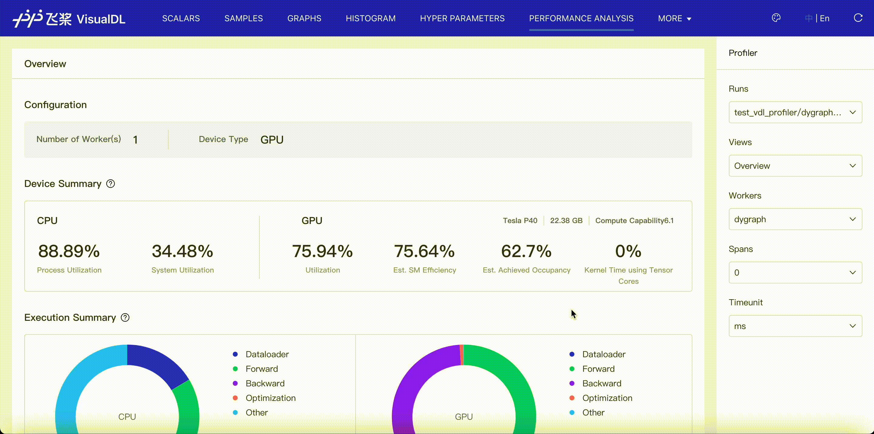
VisualDL supports to visualize profiling data exported by paddle and helps you identify program bottlenecks and optimize performance. Please refer to VisualDL Profiler Guide.
The X2Paddle component is used to read the onnx model, display the network structure of the onnx model, and help users convert the onnx model into a paddle model. Users can compare the original onnx model and the converted paddle model network, and obtain the converted model for use.
Launch the panel by:
visualdl --port 8080
Then, open the browser and enter the addresshttp://127.0.0.1:8080 to use X2Paddle component.


Note: If failed to convert an onnx model to paddle, you can copy the error message of the model conversion to X2Paddle issue to help us improve this tool.
The FastDeployServer component assists users to use fastdeployserver to deploy service conveniently based on FastDeploy project. It mainly provides the functions of loading and editing the model repository, service management and monitoring, and providing the client to test service. Please refer to use VisualDL for fastdeploy serving deployment management.

The FastDeployClient component is mainly used to quickly access the fastdeployserver service based on FastDeploy project, to help users visualize prediction requests and results, and make quick verification of deployed services. Please refer to use VisualDL as fastdeploy client for request visualization.

VDL.service enables developers to easily save, track and share visualization results with anyone for free.
pip install visualdl --upgrade
visualdl service upload --logdir ./log \
                        --model ./__model__


此处可能存在不合适展示的内容,页面不予展示。您可通过相关编辑功能自查并修改。
如您确认内容无涉及 不当用语 / 纯广告导流 / 暴力 / 低俗色情 / 侵权 / 盗版 / 虚假 / 无价值内容或违法国家有关法律法规的内容,可点击提交进行申诉,我们将尽快为您处理。